Swift Tales 1
July 2024 — This is the first installment of how my team and I built the iOS version of Times Product Language (TPL), The New York Times' design system.
Starting with zero iOS experience, in 2 months we all learned SwiftUI and shipped color, typography, and spacing for NYT's iOS apps.
The TPL team was me, Joseph Kohlmann, Sergio Cuevas, Riley Sykes, Jaclyn Saik, Mallaigh Ashton, Norel Hassan, and Dan Mall.
Humble beginnings
"Should designers code?”
"Yeah, if you want to." is my usual answer.
At the start of 2024, we were stunned when leadership asked us to build iOS components. This was a huge break for our scrappy team. But inconveniently, we were all starting from Rectangle() one. None of us had ever built anything in iOS.
But yeah, I wanted to.
Norel and Dan let me take a shot (for which I'll be forever grateful). I learned the same way our engineers Joe and Sergio did: we spent many hours Googling, practicing, and rigorously iterating our work. I studied at nights and had fun making sample projects with Hacking With Swift. Swift Playgrounds also hooked me.
I naturally developed strengths different from Joe and Sergio. As deeply experienced engineers, they excel at making iOS source code efficient for production by applying their wisdom from other languages.
But as a designer, I really love connecting other dots:
- During prototyping, where I need to balance design requirements and engineering feasibility (see my latest iOS prototypes in GitHub.)
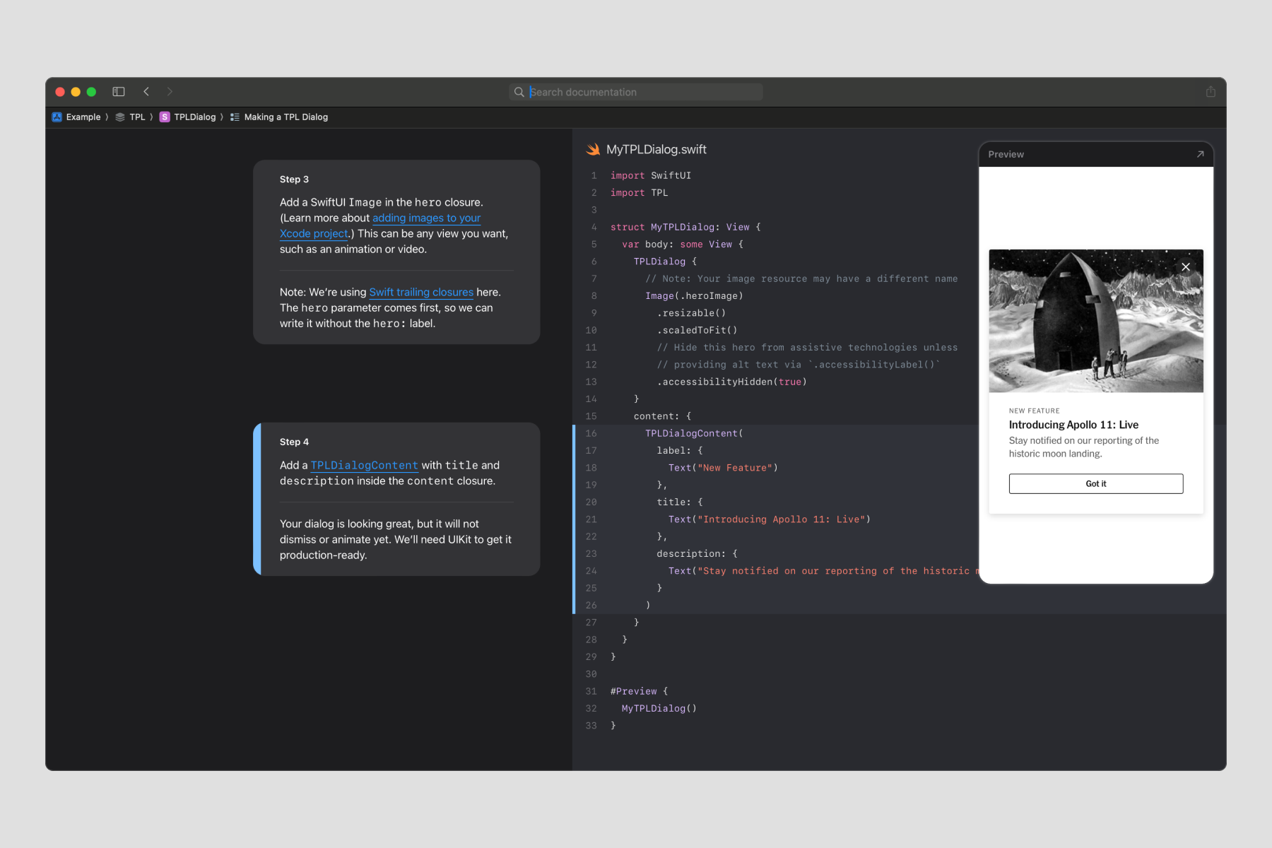
- During polish, where I need to make documentation and code comments feel like a cohesive product (see Swift Tales 3 for an example).
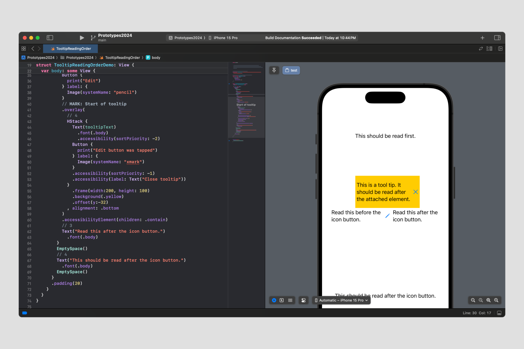
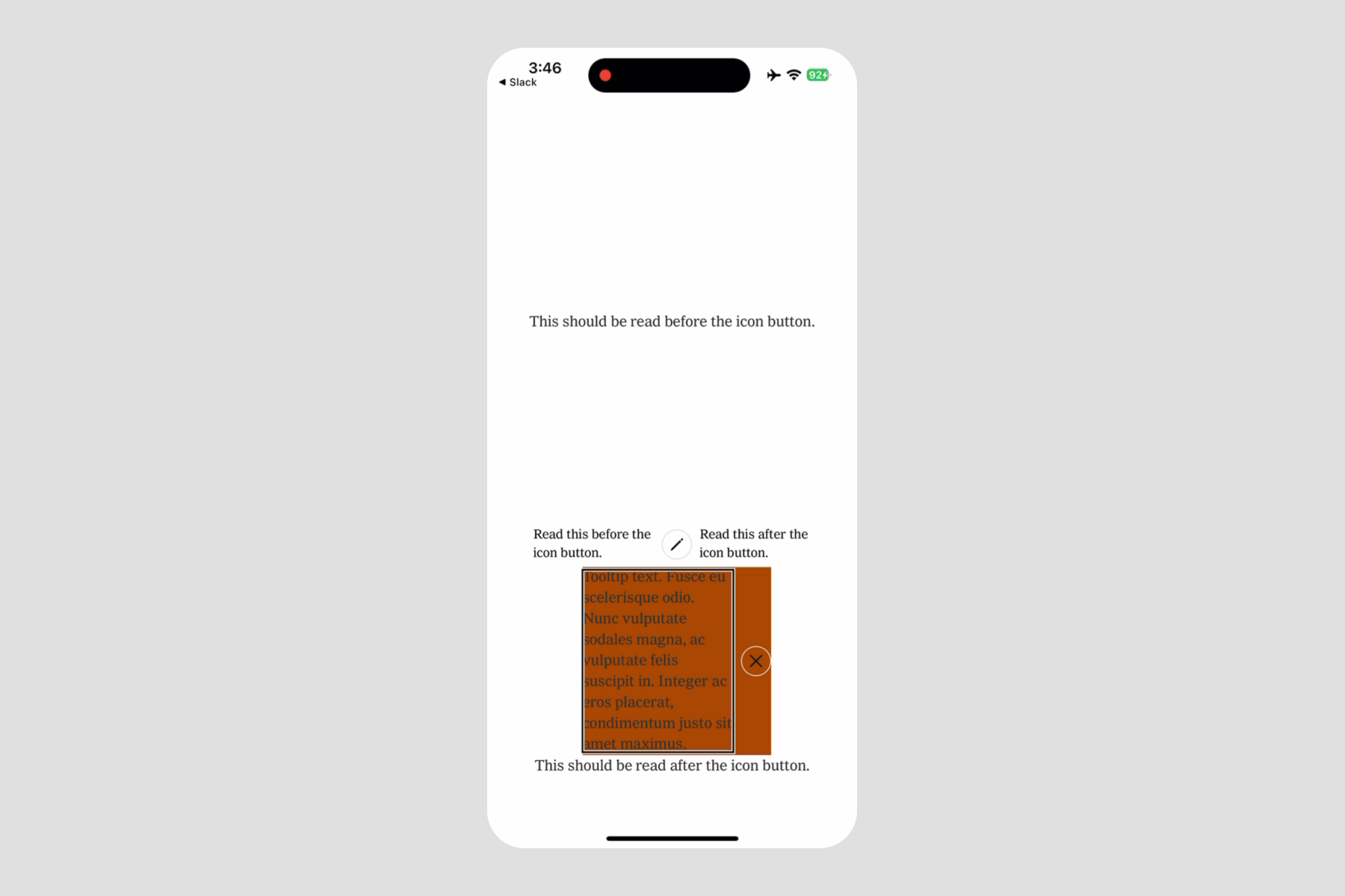
- During accessibility quality assurance, where I can quickly rework a design if an Apple API offers better VoiceOver or Dynamic Type capabilities.
Line height
We felt ready to tackle typography. I was responsible for translating the metrics. I think the journey to translate line height to iOS I think shows the lens (and obsession) designers can bring to a typical engineering problem.
I, like many others at NYT, have a deep appreciation for line height (the space between lines of text). Proper line height improves reading and visual harmony, but understandably, it's not always top of mind for engineers amongst myriad other priorities. I was motivated to fill the gap for my typography-inclined friends.
Our design system uses JSON to store a single source of truth for basic design decisions. Ideally, one value can be directly injected into our code or conveniently translated to work with a platform’s preferred convention. My responsibilities were to decide what integer makes the most sense to represent line height in JSON and to figure out how to make it work in SwiftUI.
On web, line height can be expressed in any unit accepted in CSS; unitless numbers are most accessible. In Figma, line height is expressed either in pixels or as a percentage.
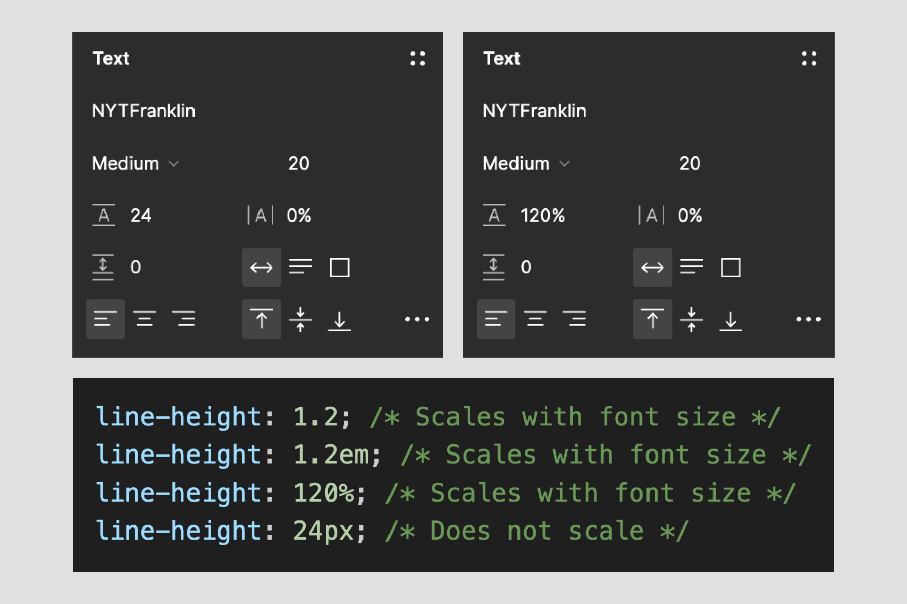
I used Xcode to study how line height is set in SwiftUI and UIKit, called lineSpacing. I learned lineSpacing also takes an integer… but using the number that Figma produced was way off. What’s happening here?
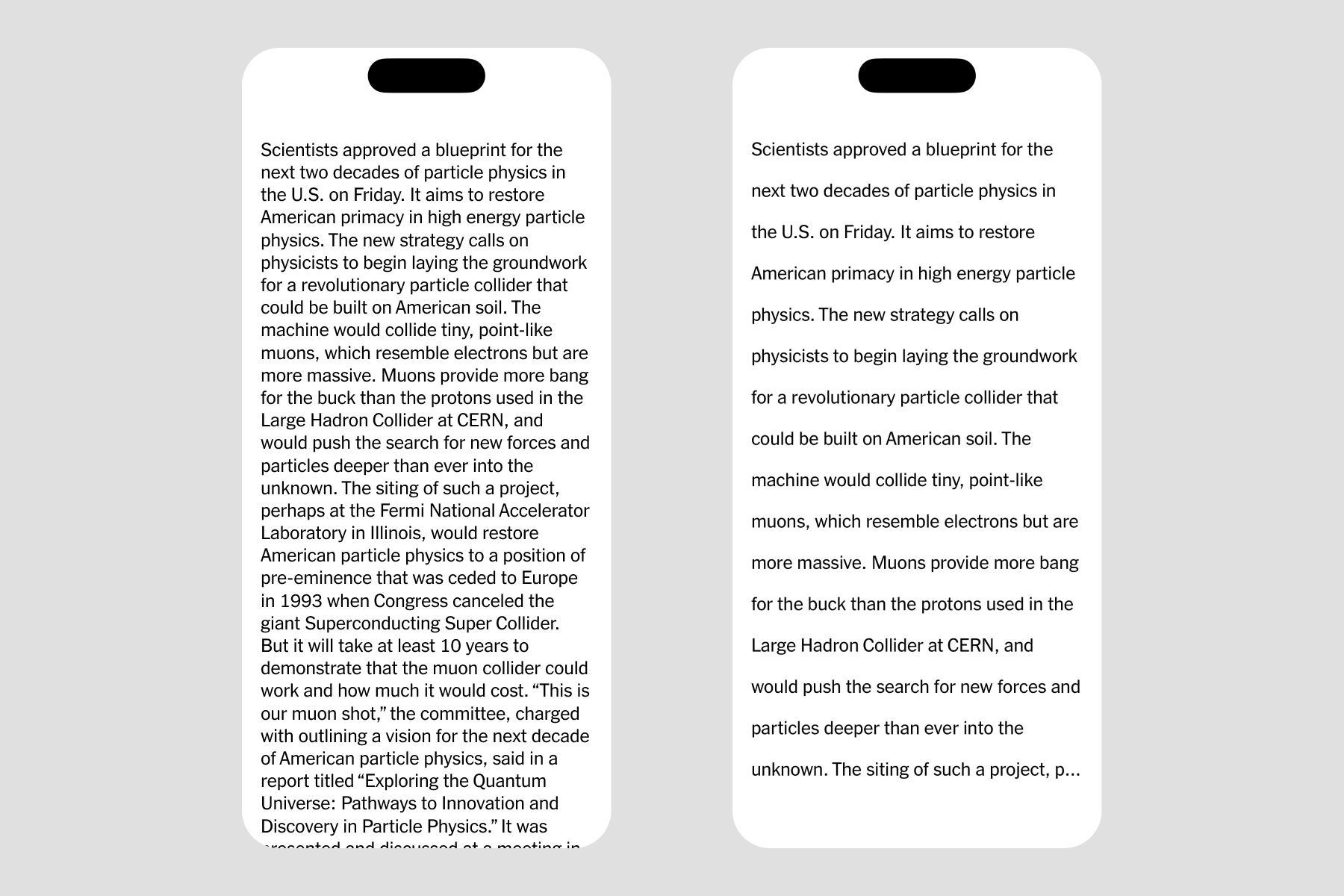
iOS’s lineSpacing works similarly to pixels in Figma and web, but the integer starts with the font size. For example, a lineSpacing value of 0 applied to a font size of 16pt yields a 16pt line height, and a lineSpacing value of 2 applied to a font size of 18pt yields a 20pt line height.
With this knowledge, Joe and I decided to store a percentage in JSON and then translate it to an integer in iOS with the following formula I created:
line spacing equals font size multiplied by percentage then subtracted by font size
Interestingly, I discovered it’s impossible to provide a lineSpacing value less than 0, or 100% of the font size. This isn’t common in practice, but alas, one of The New York Times' condensed fonts used less than 100% on web. When I brought this up to my new iOS engineering friends, I was aghast to learn that for 10 years (!) this particular font was culturally known to be a pain and “impossible to fix”.
But how fortunate I felt. My journey led me to find a problem that annoyed engineers for years, and one I uniquely had the skill and patience to fix. Over 2 days I used FontForge to adjust the metrics manually, tested it in Xcode, and together we shipped the fixed font file to production. You can find it in the Games app.
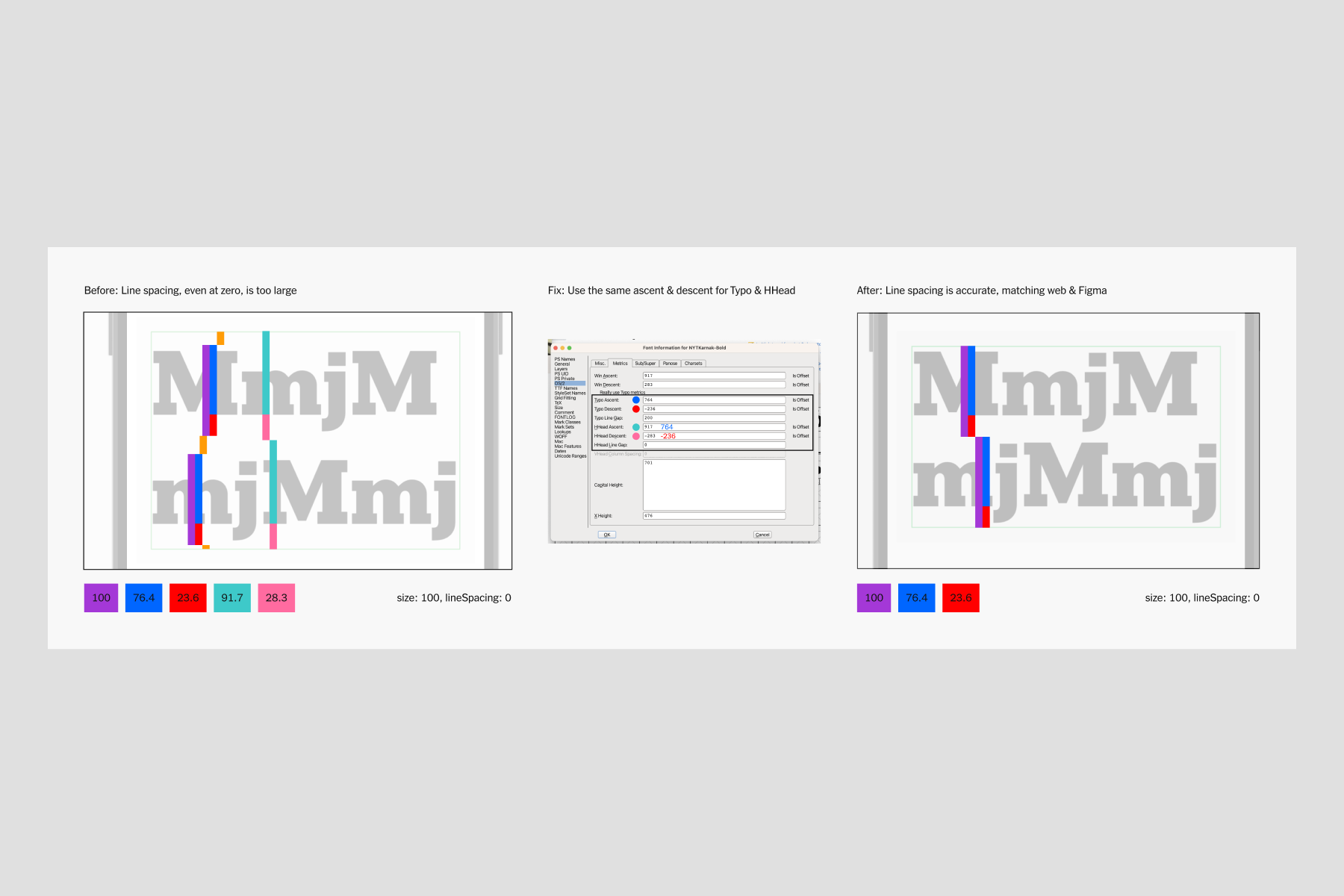
I found another strange truth in how iOS distributes line height around text.
While web and Figma equally split line height above and below a line of text, Apple places space only in-between lines of text. Yes, this is why our designs have spacing issues around text after handoff! Joe and I call this the “half-leading problem”.

By now you know how much I care about line height. But I also have some new hard-earned wisdom. While in the past I may have insisted my engineers “fix this”, I now know the half-leading problem has no simple solution. We decided not to attempt a programmatic fix to stay within scope and meet our deadline.
Summary
In 2 months, I, Joe, and Sergio learned the basics of coding in iOS and distributed color, typography, and spacing tokens for use in SwiftUI, all meeting the rigorous accessibility and visual quality of standards of the Times. I used my new Xcode prototyping skills to solve problems quickly and to balance design requirements with engineering feasibility.
In the next installment, we’ll dive into our first iOS component.